I mentioned several days ago that I was working on an update to the Stormbirds site with the goal of updating the template and hopefully solving some technical issues along the way. I’m pleased to report that the first part of that effort is now underway, however, what you see now is not entirely what I have envisioned and so there will be additional changes coming in the next several days and no doubt weeks and months.

So what’s new? The biggest change is that for the first time in this site’s history, I have moved to a new template. Strictly speaking, I did update the template once before but it was from version 1 to version 2 of the same overall scheme. More recently I also started using an alternative template for news posts pushing the featured image to the top and making for more readable space. Time marches on and technologies change and the site has been having several underlying issues that I was not able to work with under the old template. Rather than change for change sake, occasionally it is important to do a refresh.

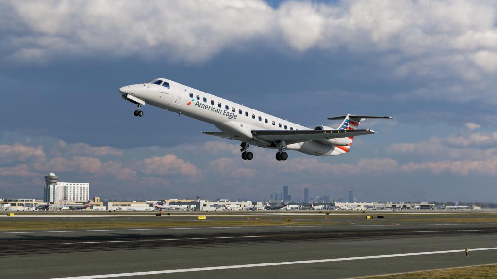
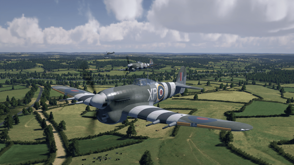
The new template is now in place but I intend to do more with it and more is possible. More modern WordPress templates have more control over how content and elements are arranged and while I’ve initiated the first set of changes that I wanted to see, there are more things I’d like to change. The overly large heading and featured image I’d like to cut down a little while still maintaining the visual appeal and punch of some (hopefully) beautiful flight sim graphics. The templates for pages needs refinement too.

You’ll note that I’ve also updated the logo for Stormbirds to match the new set of fonts available. You’ll hopefully note that I’ve retained the same sans-serif (for the font nerds out there) style and the wings on either end of the logo are still there with some tweaks to the size and angle. It’s new, its a little bit fresh, and I reserve the right to continue to tweak it.

The TL;DR of all of this is that Stormbirds is still very much continuing on, there’s more work to do, and I appreciate everyone’s feedback and comments so far. You were all encouraging and I hope I’ll continue to hear on what is working well, what you like about the new setup, and what still needs some effort to be put in. This is not the end of this update but the beginning.


22 responses to “Welcome to the updated Stormbirds!”

  1. Frederico Zveiter Avatar
    Frederico Zveiter

    Looking good!

    Liked by 1 person

    1. Thanks! More work to do but a good step forward for the site!

      Liked by 1 person

  2. As far as I am concerned you didn’t need to change anything, but the site is as attractive and easy-to-use as ever. Thank you for all your hard work!

    Liked by 2 people

    1. Glad to hear it! Let me know how it’s going as the new template sinks in. There were some underlying issues with the tech that were causing me a bunch of grief and it looks like the switch to the new template gave me some new options but also hopefully helps to evolve the site AND still make it nice and easy for everyone to read.

      Like

    1. Let it sink in for a few days and let me know how it’s going!

      Like

  3. Hello, thank you for your great work and progress. I hate to write this considering how much work goes into it, but the new website design is confusing and the original one was better.

    Like

    1. Thanks for the comment Wildvalach! See how it sinks in over the next couple of days. I hope that its familiar enough to be basically the same in overall function. Let me know if something isn’t working for you.

      Like

    2. One quick follow-up, the new site now has a main menu link called News Archive and the format is awfully close to the way that the front page was on the old site. I hope this helps out! https://stormbirds.blog/news-archive/

      Like

  4. It looks nice and clean. Congrats and Happy New Year!!

    Like

    1. Thanks and a happy new year to you as well!

      Like

  5. Congrats on the new design!

    In the old version I left your last article in an open tab and refreshed once in a while. At the end of every article were links to previous and next articles. I can’t find those here. Do you intend to add them or should I make a habit of going to the main page?

    Like

    1. Thanks! Good question… there’s a new “trending” section on the bottom that should do the same thing. I may move it up into the sidebar but I worry about how distracting it could be. See what you think!

      Like

  6. Great stuff! If you need any graphical stuff that I can help you with then don’t hesitate to sing out amte, y’know where I am!!

    Liked by 1 person

    1. Thanks! Always appreciate it!

      Like

  7. Looks really nice! 🙂

    Like

  8. mysteriously4dd23e3fb7 Avatar
    mysteriously4dd23e3fb7

    I like the new format, much better than the old.

    Liked by 1 person

    1. Glad to hear it!

      Like

  9. I would like the list of recent comments back. I often use it to see what people have commented.

    Liked by 1 person

    1. ShamrockOneFive Avatar
      ShamrockOneFive

      Oh yes! I have just brought that feature back to life. Thanks for the comment!

      Liked by 1 person

  10. Panos Simandirakis Avatar
    Panos Simandirakis

    I liked the old one but I think this is better. Well done.

    Liked by 1 person

    1. ShamrockOneFive Avatar
      ShamrockOneFive

      Thanks very much! I’m glad to have split the difference 😉

      Like

Leave a comment

Trending